
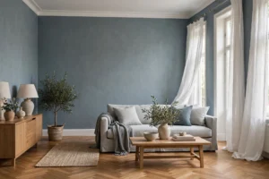


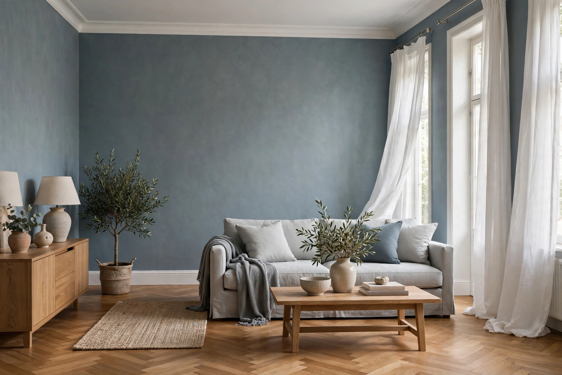
Plain blue grey wallpaper is a pattern-free wallcovering in the blue grey family, where texture does the design work instead of print. Think linen weaves, grasscloth effects, fine embossing and soft plaster looks. The color sits between blue and grey, so it reads calm like grey and fresh like blue. It suits living rooms, bedrooms and hallways especially well. Pale shades open up small rooms. Deep navy-grey shades add drama on a single wall. Because there is no pattern to match, a plain paper also wastes less per roll. This guide covers shades, finishes, rooms, matching paint colors, roll counts, hanging and care.
One honest note before the details. Screens shift this color more than most. A shade that looks soft blue online can read steely grey at home. The guidance below helps you choose well. A sample on your own wall still settles the argument.
What Blue Grey Actually Means on a Wall
Blue grey is not one color. It is a family that runs from misty blue to charcoal with a blue cast. The mix decides the mood. More grey gives you a quiet, neutral wall. More blue gives you a fresher, cooler one. Neither mix is better. The right one depends on your light, your floor and your furniture.
The shade ladder, from pale to deep
At the pale end sit powder and mist shades. These are the light blue wallpaper end of the family. They reflect the most light and feel airy. In the middle sit slate and denim-like tones. Mid blue grey is the most forgiving choice on the ladder. It hides minor marks and pairs with almost anything. At the deep end sits navy blue wallpaper territory. Navy-grey feels rich and cocooning. It works best on one or two walls, or in rooms with strong light.
Undertones and your room’s light
Every blue grey leans somewhere. Some lean green, like slate or sea glass. Others lean violet, which reads softer at dusk. Your light pushes the color further still. North-facing light is cool and bluish. It can make a blue grey look flat and grey. South-facing light is warm and generous. It softens the blue and flatters most shades. So test a large sample for a full day. Check it in morning light, at noon and under your evening lamps.
Plain or Patterned? How to Decide
A plain wallpaper gives you color and texture, nothing more. That restraint is the whole point. The wall becomes a backdrop, and your furniture and art take the lead. Retailers sort plains by texture rather than design. You will see linen effects, woven mesh looks, grasscloth styles and concrete looks. All of them say “plain” on the label. They behave very differently once hung.
When a plain is the better call
Choose a plain when the room already has plenty going on. Patterned sofas, busy rugs and gallery walls all fight with a printed wall. A plain also suits all four walls better than most prints. It keeps the room calm from every angle. First-time decorators like plains for another reason. There is usually no pattern repeat to line up. Many plains are free match, so each length hangs straight from the roll. That means less waste and fewer mistakes.
When stripes earn their place
Striped wallpaper does one job brilliantly. Vertical stripes make a ceiling feel higher. A fine pinstripe in blue grey reads almost like texture from across the room. It suits hallways, box rooms and low-ceilinged living rooms. Wide stripes are bolder and need a bigger wall. If you love the plain look but want some movement, stripes are the closest cousin.
When florals earn their place
Flower wallpaper on a blue grey ground is a classic pairing. The cool base calms bright blooms and stops them feeling sugary. Searches for grey wallpaper with blue flowers show how often people combine the two. Keep florals to one wall in most rooms. Bedrooms and traditional living rooms carry them best. The other walls can stay plain in a matching blue grey. That mix gives you pattern and rest in one scheme.
Finishes and Textures Compared
Finish decides how a wall handles light and how much it forgives. Matte finishes absorb light and hide small bumps. Sheen finishes reflect light and show every ridge. Texture sits between the two. A woven or embossed surface breaks up reflections and masks minor flaws. The table below sums up the main choices.
| Finish | Look | Hides wall flaws | Best for | Typical care level |
|---|---|---|---|---|
| Matte non-woven plain | Flat, soft color | Poorly | Bedrooms, quiet walls | Spongeable to washable |
| Textured vinyl (linen, mesh, embossed) | Visible weave or grain | Well | Living rooms, hallways | Washable to scrubbable |
| Grasscloth-style | Natural, fibrous | Moderately | Feature walls, dining rooms | Spongeable; check the label |
| Subtle metallic sheen | Soft glow under lamps | Poorly | One feature wall | Washable; varies by roll |
Care ratings differ by roll, so treat the table as a guide. The label on your chosen roll is the final word. Heavyweight embossed vinyls sit at the tough end of the range. Flat matte papers sit at the gentle end. Pick the finish for the room’s traffic first. Pick the exact shade second.
Blue Grey Wallpaper in the Living Room
The living room is where blue grey earns its keep. A mid-tone plain on all four walls gives you a calm shell. The sofa, rug and cushions then set the temperature. Warm woods and off-white upholstery keep the scheme friendly. Black picture frames and a black lamp or two sharpen it. Matte finishes suit TV walls best. They cut the reflections a sheen would throw back at the screen.
Half-height wall paneling under wallpaper is another popular layout. The paper sits above the rail, and painted paneling takes the knocks below. If you add trim or panel molding yourself, it helps to know what brad nails are used for first. Thin trim splits easily under the wrong nail.
A deep navy-grey feature wall behind the sofa also works well. Keep the other walls pale, in paint or a lighter paper. Then repeat the navy in one cushion or a throw. The room feels designed rather than decorated by accident.
Blue Grey Wallpaper in the Bedroom
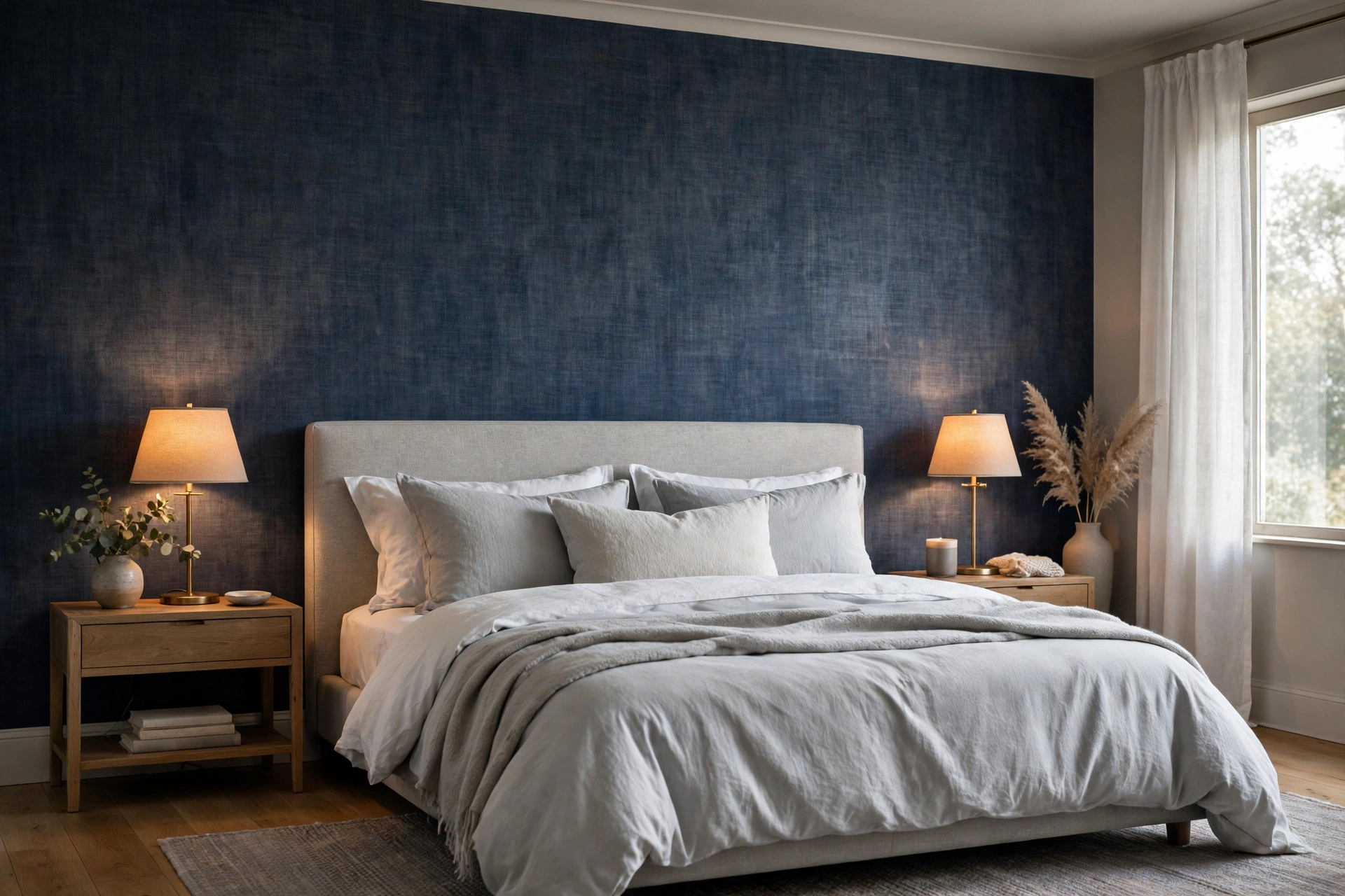
Bedrooms reward the soft end of this family. Light blue wallpaper shades calm the room without turning it cold. White or warm-white bedding keeps the contrast gentle. Linen and washed cotton add the texture a plain wall asks for. Blush pink and soft beige both warm the palette. Navy and silver accents push it cooler and smarter.
For a bolder bedroom, run navy-grey behind the bed only. The headboard wall becomes a cocoon. Pale bedding and warm lamp light stop the corner feeling dark. This layout suits larger bedrooms best. In a small bedroom, keep navy to cushions and a throw instead.
Nurseries and children’s rooms
Pale blue grey is a nursery favorite for good reason. The shade is soft, calm and not tied to pink or baby blue. Several plain ranges are designed for children’s rooms in exactly this color. A washable finish earns its place here. Small hands test every wall within reach. As the child grows, the same wall still works. Swap the cot for a desk, and the shade needs no apology.
Hallways, home offices and small rooms
Hallways take mid-tone plains well, because doors and art break up the run. Pick a paper with good lightfastness for a sunlit hall. Home offices suit mid blue grey too. The color is calm, not distracting, and flattering on video calls. Small rooms are not off limits either. A pale plain on all four walls can feel bigger than white. There are no pattern edges to chop the space into pieces.
Bathrooms and kitchens: read the label first
Room suitability varies more than shoppers expect. Many plain wallpapers state “any room, excluding bathroom and kitchen” on the label. Steam and splashes are the reason. Vinyl-faced papers cope far better with humidity. Some vinyl designs are sold specifically for bathrooms. In a kitchen, choose a washable or scrubbable finish. Keep paper away from direct water and stove heat. Good ventilation matters as much as the paper itself.
Dining rooms
Dining rooms suit the deep end of the family. Lamp light and candlelight flatter navy-grey after dark. The room also gets used in short bursts, so drama tires nobody. A grasscloth-style texture adds the formality dining rooms like.
Colors and Paint That Match Blue Grey Wallpaper
Start with the woodwork. A warm white on baseboards and doors softens the cool wall. A very blue white can look stark against it. For a tonal scheme, paint the woodwork a paler blue grey instead. Our complete guide to elegant home decor living shows how layered neutrals build a calm room.
Named paints in the same family help when you shop. Benjamin Moore Boothbay Gray leans grey and suits trim or a linked wall. Benjamin Moore Smoke is a soft mid tone often picked for bedrooms. Sherwin-Williams Krypton and Misty sit at the cooler, lighter end. Farrow & Ball Kittiwake is a clean mid blue grey. Farrow & Ball Parma Gray leans bluer and fresher. Treat these names as starting points, not guarantees. Every brand mixes the family slightly differently.
Furniture and metal finishes set the final temperature. Brass and gold warm the wall up. Chrome and silver push it cooler. Light oak and rattan ground the scheme and stop it feeling formal. For a color pop, try mustard, blush pink or forest green in cushions and art. Small doses work best. The wall stays the calm part of the room.
Curtains, rugs and the floor
Curtains decide how formal the wall feels. White or natural linen keeps the look light and coastal. Navy or charcoal curtains add drama and echo the deep end of the family. A rug bridges the wall and the floor. Pick one with blue grey and warm beige threads when the floor runs warm. Bare floors matter too. Pale oak softens a cool wall, while dark walnut sharpens it.
How Many Rolls Do You Need?
Start with the coverage figure on the label. A standard roll measures about 33 feet long and 20.5 inches wide. It covers about 57 square feet before trimming. Roll sizes vary by brand and country, though. The coverage printed on the label is the number to trust.
Work in drops, not just in area. Say your wall is 12 feet wide with an 8-foot ceiling. You need seven drops across that wall. Each roll gives you four full drops at that height. So one wall takes two rolls, with paper to spare. Free-match plains make this math kind. Patterned papers need extra length for the repeat.
Add roughly ten percent for cuts and mistakes. Keep one spare roll for future repairs. Buy every roll from the same batch number. Print batches vary slightly in shade. A plain shows those shifts far more than a print does.
What Does It Cost?
Prices spread widely across this family. At large home stores, plain blue grey rolls sit at the budget end of the wallpaper range. Designer linen and grasscloth styles cost two to three times more per roll. Peel and stick rolls cost more again, for less coverage. Your real budget is rolls plus paste, tools and a spare. The worked example above needed two rolls for one wall. A full mid-size room can take four to six. Samples cost a few dollars each. Buy two shades and test both, rather than guessing once.
How to Hang Plain Blue Grey Wallpaper
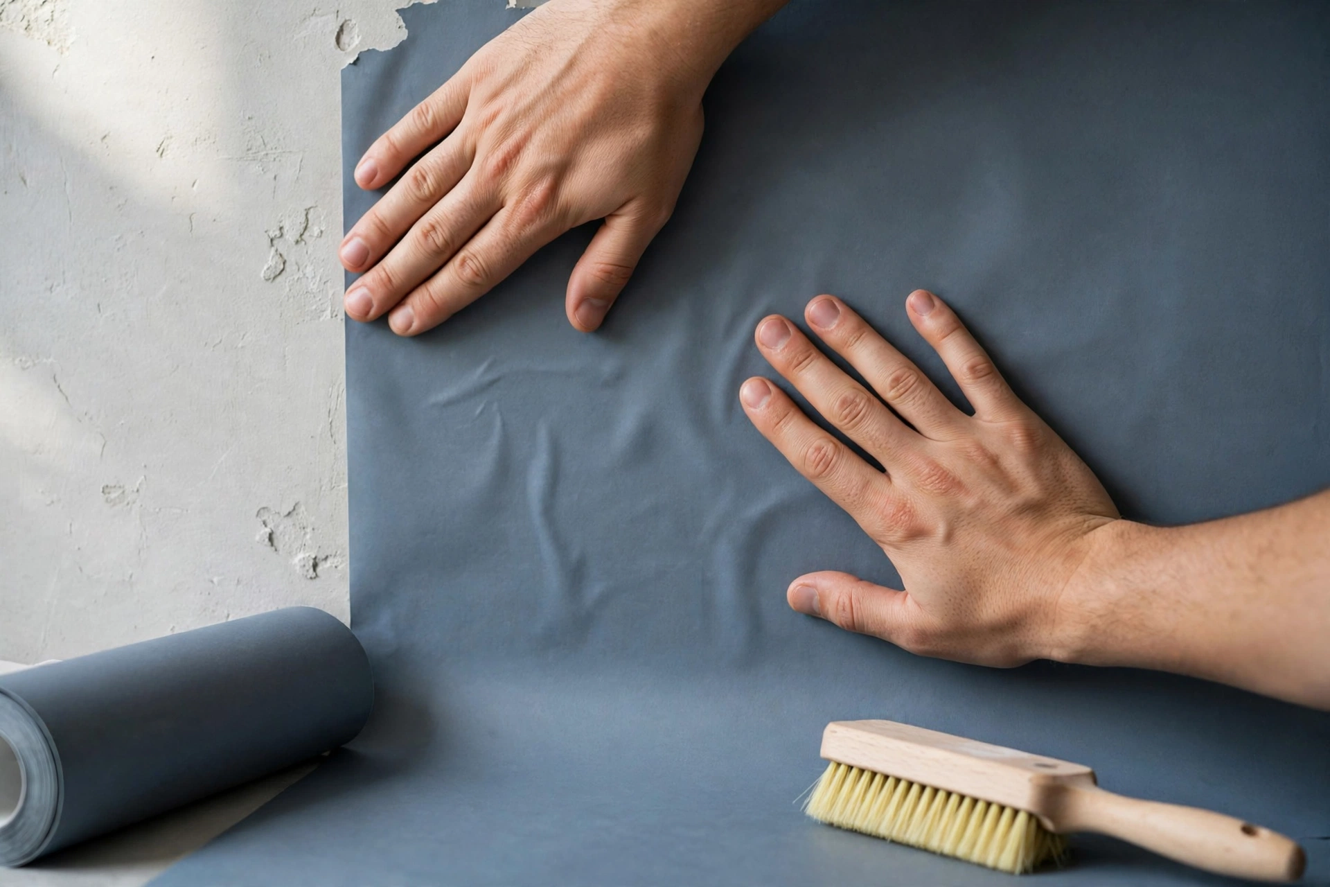
Most modern plains are non-woven and paste-the-wall. You paste the wall, not the paper. That makes hanging faster and cleaner for beginners. Check your label first, though. Some papers still need paste on the paper itself.
Preparation decides the result. Fill cracks and sand ridges smooth. Wash off dust and grease, then let the wall dry fully. A flat plain shows every bump under side light. Deal with any mold before you start, not after. Our guide to whether vinegar kills mold explains what it can and cannot fix. Paper over damp and the problem grows behind your new wall.
Rough walls get one extra step. Hang lining paper first, across the wall, and let it dry fully. Lining paper gives a thin plain a smooth, even base. It also evens out suction, so the paste dries at one speed. The extra hour saves the finish you actually see.
- Mark a plumb line for the first drop. Walls are rarely true, so never start from a corner.
- Paste the wall, slightly wider than one drop.
- Hang the drop, smooth from the center outward, and check the edge against your line.
- Trim the top and bottom with a sharp blade. Change blades often, because a dull blade tears wet paper.
- Butt the next drop edge to edge. Plain lengths should meet, not overlap.
- Roll each seam once, gently, then wipe off stray paste with a damp sponge.
Peel and stick instead?
Peel and stick wallpaper suits renters and short-term refreshes. It goes up without paste and peels away cleanly from sound paint. Expect to pay more per roll for less coverage, though. Textured walls and steamy bathrooms also defeat the adhesive. Choose it for one calm wall, not a whole steamy room.
Mistakes That Make Blue Grey Look Wrong
Testing a tiny swatch. A postage-stamp piece tells you almost nothing. Tape up a full width and live with it for a day.
Deep shade, dark room, no lighting plan. Navy-grey on every wall of a dim room turns cave-like. Add layered lamps, or drop the shade two steps paler.
A dead-flat plain on rough walls. Hallways collect knocks, bags and keys. A textured vinyl hides that daily wear far better.
Ignoring the floor’s undertone. Cool blue grey can clash with orange-toned wood or warm beige tiles. Bridge the gap with a rug or wood tones that sit between the two.
Mixing print batches. Two rolls from different batches can hang like two different colors. The shift shows worst of all on a plain.
One last check if a finished room still feels chilly. The cause may be moving air, not the color on the walls. See how to seal doors and windows against drafts, and fix the gap before you blame the shade.
Care and Cleaning: The Ratings Decoded
Wallpaper labels grade cleaning in plain words. Spongeable means a damp sponge lifts fresh marks, and nothing more. Washable allows gentle cleaning with mild soap. Extra washable handles more water and effort. Scrubbable is the toughest grade on the scale. It allows a soft brush with mild detergent. Hallway and kitchen papers should sit near the top of that scale.
Day to day, dust with a dry cloth or a soft vacuum brush. Treat marks early, while they are still fresh. Work from the edge of a mark inward, so you do not spread it. Keep seams as dry as you can. For sunny walls, check the lightfastness rating too. “Good lightfastness” means the color resists fading in normal daylight.
Removal is kinder than it used to be. Many non-woven plains are dry strippable. The top layer peels away by hand, with no steamer needed. Check that label line before you buy, especially if you rent.
Frequently Asked Questions
Is blue grey wallpaper warm or cool?
It belongs to the cool family, because blue and silver-grey undertones read cool. Cool does not have to mean cold, though. Warm lighting, wood and soft textiles change the feel completely. Greige-leaning greys sit at the warm edge of the wider grey family.
Can I use plain blue grey wallpaper on all four walls?
Yes, pale and mid-tone plains are made for exactly that. Texture helps, because it stops a full room feeling flat. Deep navy-grey shades work better on one or two walls. The exception is a large, bright room that can carry the depth.
Does dark blue grey wallpaper make a room look smaller?
It makes the walls feel closer, so the room reads smaller and more enclosed. Many people like that depth in bedrooms and dining rooms. A pale ceiling, lighter flooring and good lamps keep the shape of the room clear.
Can blue grey wallpaper work in a small room?
Yes, and light shades can make a small room feel larger. A pale plain reflects light and has no pattern to break the walls up. Mid tones also work when the room gets decent daylight. Save the deep shades for one wall only.
Is blue grey wallpaper suitable for a bathroom?
Only some of it is. Vinyl-faced wallpaper handles steam and splashes far better than a standard plain. Many plain papers exclude bathrooms and wet rooms on the label. A shower-free toilet or powder room is an easier case. Ventilation decides how well any paper lasts there.
Why should I order a sample first?
Screens hide undertones, and undertones run this whole color family. A sample shows whether your grey leans blue, green or violet. It also reveals the true texture and sheen beside your floor and furniture. Judge it in daylight and lamplight before you commit to rolls.
